Sunday, December 9, 2007

Grimshaw's Summer

So, the piece I've really been obsessing over this semester is Summer, a painting by John Atkinson Grimshaw (1836-1893). I had never heard of Grimshaw before this semester, and for good reason. He's more or less a provincial painter from Leeds, but in 1875 he did this interesting series of four paintings, including Summer at his house, Knostrop Hall, on the outskirts of Leeds.

Summer


In the Pleasaunce

Spring

Il Penseroso

They all depict a single female figure, they all show the cultivation of nature, and they all include at least one Japanese object as well as some sort of historical detail. I'm actually writing about Summer for two seminars, much to the chagrin on my professors. The first seminar is on Taste and the other is on Art & Empire, and between the two they would seem to cover all the interesting bits about these works. By the time I'm done I'll have written 40 pages on this image and still not have said it all. An art historian's work is never done . . .

Monday, November 5, 2007

Strolling through Meiji Japan

Somehow or other, all the rest of my papers for this semester are about exchanges between Japan and the West in the late-nineteenth century. For my class on Japanese prints, we had to pick a topic relating to Yoshitoshi, considered the last great master of the ukiyo-e tradition. One of his most popular prints is "Stolling: the appearance of an upper-class wife of the Meiji era," which depicts a woman in (gasp!) western dress. This is particularly surprising coming from the traditionally oriented Yoshitoshi.


But it turns out that when this print was published in 1888, western dress was incredibly popular amongst upper-class women and even amongst geisha. Men adopted western dress first; it was mandated for military uniforms and then for bureaucrats. The empress and her court adopted western dress in 1886 and recommended that other women do the same in a mandate of 1887. There are many prints of the empress from this time that surely helped promote the fashion. Below we see the empress dressed in black in the middle, accompanied by the crown prince and flanked by court ladies sewing western clothing. The inscriptions on top are instructions in these new techniques.

Many of the pictures of the imperial couple wearing western clothing show them at some event that similarly symbolizes the modernization of Japan: the opening of a railroad, instructing school children, riding in a carriage, etc. But other images show them engaged in the rather traditional Japanese activity of viewing blossoms or foliage. "Strolling" similarly references the iris gardens in Tokyo, the Horokiri, which are shown below in a hand-painted photograph from the late nineteenth century.

So I'm interested in this tension between tradition and modernity, as well as the changing role of women that the print might represent. Part of the reason why upper-class Japanese women wore western dress was because they were entertaining westerners at balls and other new social events. Not only was it impossible to do the polka in a kimono, it was also entirely new for wives to interact socially with men at entertainments, since traditionally men were entertained by professional geisha. And as part of the social upheaval happening at this time, some geisha were actually marrying their patrons, themselves becoming wives of highly-placed men in government and hostesses at these international gatherings. Other geisha were wearing western clothing just to retain their usual places at the forefront of fashion. Since western dress eradicated tradition sartorial signs of rank and class, the emergence of this foreign dress may have reinforced the blurring of distinctions between the "upper-class wife" that is specified in "Strolling" and a geisha.

Sunday, October 28, 2007

Jeremy Flattau

Before I left New York, I was lucky enough to get a glimpse of Jeremy Flattau's work in various funky living rooms across Brooklyn. The subject content may be all about street cred but his works also have wonderful formal qualities. The colors are saturated and the paint has a sensual fluidity to it that draws you in. Very Rothko meets Warhol. Enjoy my favorites below and check out more at jeremyflattau.com

http://www.jeremyflattau.com/images/shoes.jpg

http://www.jeremyflattau.com/images/biggiex3blue.jpg


http://www.jeremyflattau.com/images/boat.jpg

Wednesday, October 10, 2007

A Tondo Frame

I recently had a conversation with some fellow graduate students on how the process of choosing, researching, and writing a paper resembles dating. First you play the field, meaning that you do some preliminary research try and find a paper topic. We agreed that choosing a topic is rather stressful, much like committing to a significant other. Then comes the really fun part, the sex, when you're doing your research. But eventually you have to actually produce something, which, like having kids, is supposedly rewarding but also involves a lot or work and anxiety. What if it turns out to be ugly or inarticulate?

In my introductory graduate seminar, we had to pick an object to write about throughout the semester. This forced us to commit to something early, but does somewhat relieve the stress of birthing your paper all at once at the end of the semester. My object is a frame. I picked it because it's large and elaborate and threatens to visually overwhelm the work of art it was supposedly designed to enhance.


The piece inside the frame is a marble bas-relief sculpture, in a round format known as a tondo, which dates from the 1490s and depicts Madonna & Child. The frame is definitely twentieth century, it was probably made in 1951 at the National Gallery of Art, Washington, when the tondo was being exhibited there. Yet it turns out that the frame uses a lot of Renaissance framing designs and techniques, so it seems to have been done in a self-consciously neo-Renaissance style.


I've been reading Derrida's essay on the "Parergon" (that which surrounds the work=the frame) which deconstructs the importance of the frame to modern aesthetics (since Kant). Basically the frame is essential in separating the space of Art from the space of everyday life, and this separation is the foundation for many of our assumptions about art. Because the frame belongs at once to both spaces and neither space, it is systematically disavowed and relegated to the status of vulgar sensual ornament, much like the decorative arts in general, it seems to me.


Let me know if you have any thoughts, after all, raising kids takes a village :)

Wednesday, September 26, 2007

The post-modernism all around us

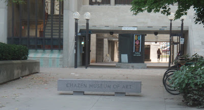
I am having a love affair with the Chazen, the building that houses the Chazen Museum of Art, the Kohler Art Library, and the art history department offices and classrooms here on the UW-Madison campus. I love the overstuffed leather chairs in the library, the elegant wood panelling in the seminar rooms, and the convenience of having everything in one place. I also love that one of the stone benches out front inscribed with the name of the museum has taken a turn for the worse. It has broken into two solid pieces and tumbled to the ground, and it now sits rather forlornly and absurdly covered by an orange and white painted barricade.

I love this ruined bench because it seems like a readymade piece of public conceptual art: an allusion to the broken institution of the museum, an examination of the band-aids that bourgeois culture slaps over its wounds, perhaps even a reference to the obstacles to art making. Its twin, still whole and sound, sits proudly across the way. In contrast it appears as a smug symbol of art's snobbery and claims to the completeness of a whole work of art. It is an embodiment of modern aestheticism, whereas my beloved broken bench embodies the post-modernism all around us, a youthful energy so vital it can tear a stone in two.

Monday, September 3, 2007

Amateur Flower Arrangements

The only thing I bought during my recent experience at the Dane County Farmers' Market were some exquisite and inexpensive gladiolas. They make a perfect arrangement all on their lonesome, because their fluttery petals nicely balance their spiky stalks. Stick them in a trumpet vase and you get an arrangement with some flare.


I've been watching the light from my big picture window play on these gladiolas for a couple of days now, and I just had to take a picture. In fact, I usually take pictures of the flowers I arrange, like I need photographic evidence that I actually created something worth looking at. This arrangement of carnations I remember took me quite awhile. I was trying for a perfect dome of tightly-packed flowers and in the end I wound up with a vaguely circular shape.


I was somewhat more successful with this arrangnement of daffodils. My secret was leaving the rubber bands from the florist on and putting the flowers together as bunches instead of individual stems.


A much more (intentionally) free-form arrangement uses the same fishbowl vase to create a similar domed shape. This one mixes deep purple lilacs with some feathery chartreuse something or other.


I'm always keeping cut flowers out longer than I should. Once the petals start to drop my roommates hesitantly start asking me when I'm going to throw out the dying flowers and I start insisting they still have a few good days left. The arrangement above mixes thistle with virbinum, and while it wasn't my most successful it was long lasting (part of it anyway). I ditched the virbinum and kept the dried thistle around for months. In an even later incarnation I cut off all the dried green outer petals and put the purple cones in a little white teapot.


One of my favorite arrangements from the past year peppered dark carnations with ranuculus in shades of red and yellow. But of course you don't have to mix flowers to get color variations. What could look better with mauve tulips tinged in white then their own spring-green leaves and stems?


Let me know which arrangement was your favorite . . .

Saturday, September 1, 2007

Dane Country Famers' Market

As regular readers of the blog know, I had visited Madison a total of one time before I moved there a week and a half ago. The visit was brief, but although I was very much occupied with finding an apartment, I did manage to catch a few snippets of what life might be like in the capital of Wisconsin. There appeared to be, as you might expect in a university town of this size, quite a local music scene. There was a co-op in the hippy part of town, lots of sailboats on the lake, and a farmers market. So this morning I eagerly walked over to the capitol building to check out the last of these amenities. I was envisioning a few stalls along one side of the square and hoping for some flowers mixed in with the produce. What I found was an absolute crush of people slowing walking around the entire square, perusing organic vegetables, award-winning cheese, honey being sold next to a bees in a glass hive, potted plants, gladiolas for 60 cents a stem, fresh trout etc., etc. It certainly put the Union Square Market in New York to shame . . .

The market took up all four sides of the square around the state capitol building. People took a time out from the hectic pace of the market to relax on the squares verdant lawns. At the corners of the square, non-profits and political groups set up stands and tables to take advantage of the passing crowds.


Active shoppers battled though touristy crowds to get to the goods. Some of the produce displays rivaled the aesthetics of my beloved New York delis.


Potted plants share stall space with arrangements of dried flowers. Fall is right around the corner.


One clever farmer had even turned dried sunflower heads into these hanging bird feeders, seeds for everyone. The fun continued down State Street, which leads from the capitol to the UW campus. State Street was also lined with stands for the annual "Taste of Madison" fair, which I'm hoping is why the farmers' market was so crowded. Because if it's like this every Saturday, well, I'll just have to go on Wednesdays instead.

Tuesday, August 7, 2007

My Neighborhood Walking Tour

Whenever I'm leaving a city that I've lived in, I make a point of wandering around with my camera. This weekend I'm leaving New York for the foreseeable future and entering phase one of my two-part move to Madison, Wisconsin, where I'll be starting a graduate degree in art history. Last weekend I couldn't exactly wander around all five boroughs, but in between sorting and packing I did manage to take one last walk around the neighborhood.


The Upper West Side has two basic streetscapes. On the left is one of the many charming tree lined blocks, still home to brownstones and other townhouses. On the right is one of the broad vista created by wide streets and heavy apartment buildings, each at an identical height, each with an identical doorman. There's no question which I'd rather live on.


I've come to think of my neighborhood as a stretch of Riverside Park bracketed by two memorials: the Soldiers and Sailors Monument at around 90th Street and Grant's Tomb at around 125th. The Soldiers and Sailors Monument, shown above left, is a tholos (a round temple form first used in ancient Greece) with Corinthian columns and an elaborate entablature and base. It is approached from the south through a lovely avenue of trees. Just below it on the Greenway section of the park is this lovely garden (above right), presided over by volunteer gardeners. Grant's tomb, below right, stands next to Riverside Church, below left, and they form an impressive sight peaking up from the trees along the river. At this point Grant's tomb is probably most famous for the question "who's buried at Grant's Tomb?" which only the most unthinking are supposed to answer wrong. I always thought that was because the answer is obviously in the title, Grant is buried is Grant's tomb, but it turns out that no one is. Grant is laid to rest there, but his body is above ground; he is entombed rather than buried.


One of my favorite things about summer is seeing and hearing little kids enjoy the sprinkler fountains around the city. There was one a few blocks away from my house growing up, so seeing them in New York brings back memories. But my favorite stretch of Riverside Park is probably this promenade, above right. It's wide, tree-lined, and dappled. It's also peppered with small overlooks, like the one below left, that offer closer views of the Hudson, below right.


Even when you walk up out of the park and onto Riverside Drive, you're surrounded by visual treats. There are still a surprising number of mansions, like this neo-Gothic one above right, that have been converted to apartments or non-profits. Entrances to the park are usually marked with large monuments, like this one above left at 106th Street.


One of the highlights along Riverside Drive is undoubtedly this Tibetan Church. The main entrance is through the modern building on the left, graced with an over life-sized statue, but the church also takes up the beaux-arts mansion on the right. Quite a combination.


Of course the neighborhood isn't all residential, but even our commercial areas have some gems. This stretch of Amsterdam Avenue, above left, converts from brunch land during the day to bar land at night. On the right is an unusual building at the corner of Broadway and 104th. It was built as an automat in the 1920s, an automat being basically a cafeteria full of vending machines. The automat as a general commercial endeavor was short-lived, but the word did make its way into the famous song "Diamonds are a Girl's Best Friend" ("A kiss may be grand, but it/won't pay the rental/on your humble flat, or help you at the automat"). This building was recently landmarked for its Art Deco exterior and is now home to a Rite Aid and a non-profit.


But one of my favorite buildings in the neighborhood is this bizarre apartment unit at the end of my block, shown in the center of the photo above left. At the top floor of its cream facade, you can just make out what appear to be two peaks that have been filled in, as if the roof used to be two gables before being converted to the flat roof we see today. It makes the building seem like a cottage on steroids, as if some giant hand took hold of a townhouse and stretched it out. You get a great view of the building from Straus Park, which stands in the triangle formed when West End Avenue runs into Broadway at 107th Street. The park is dedicated to Mr. and Mrs. Straus, an elderly couple that died together on the Titanic. The focal point of the park, shown in the photo above right, is a statue of a reclining female figure that personifies Memory.


But the true gem of my neighborhood really is my block, and not only because I live there. It has an impressive collection of beaux-arts townhouses and mansions, lovely trees, and a gentle slope. Every time I walk along it I feel lucky to live there. How can I really leave?