Tuesday, May 29, 2007

Park Slope Pad

Three of my friends from high school all conveniently live in the same apartment. Unfortunately that apartment is inconveniently located in Park Slope, three subway trains and an hour's ride away from my own. Although I don't get over there much, I'm always glad I made the trip.


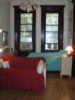
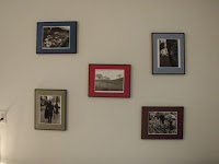
Beyond those red doors, the apartment is a typical New York conversion, in which extra bedrooms have been carved out of the interior space. But the front room enjoys lots of light and a funky mix of curbside finds. My favorite pieces in the room are the antique mirror over the white sofa (found on the street) and the dark green settee opposite it. Large framed photographs (two of the apartments residents are dating photographers) add some sophistication. The turquoise tables under the windows are a DIY project with mosaic tops.


The girls repainted the entire apartment when they moved in. The grey color in the living room is an unusual choice that really makes the architectural moldings pop. The fireplace is highlighted with a lavender background. The mirror above seems to have a kind of tropical plantation design, reinforced by the potted plants on either side and the chairs nearby: a bamboo folding chair, a brightly painted yellow chair upholstered with tropical fabric, and a plantation lounger in the corner. Opposite the windows, french doors with beautiful glass panels lead to Samantha's room. I love how the blanket stuffed above the doors (to fill in the space left by an absent transom window) matches the paint colors.


Samantha painted her room a bright yellow to make up for the lack of natural light. The cheerfulness continues in the brightly colored floral comforter cover and especially in the artwork, most of which is by Sam's sister. The combination of the Windsor desk chair, paper floor lamp, and fairy lights is quintessential Samantha.


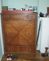
At the back of the apartment, Pamela painted her room a cool mint green. More large photographs are framed by the room's white moldings. Across the room, the fireplace displays some DC pride. Yes, that's the design of the DC flag, based on the family crest of George Washington. I love the wood dresser to the left of the fireplace with that subtle X design in the veneer.


It's the little details in this apartment that really make me smile. The door to the bathroom is denoted by a "W is for Women" sign, just to remind the fourth male roommate who's boss. Inside, a rubber-ducky shower curtain picks out the yellow accents in a painted-metal mirror frame.


Also in the back of the apartment is the luxurious eat-in kitchen, painted a brilliant turquoise. Utilitarian pots and pans take on a bohemian character when hung on the wall with dried flowers. Although its hard to tell in this photo, the table is topped with a bright-yellow floral table cloth, very 60s kitsch. A built-in shelf above holds the radio, toaster, etc. while a string of globe lights continues the turquoise color scheme.


But on my latest visit we moved those rad white plastic chairs (which are super comfortable) to the living room to enjoy a beautiful brunch. Samantha presides over her feast of Challah french toast, organic sausages, yogurt, and strawberries (not to mention Leah's perfect lattes) then snaps a photo of us digging in. Bon Appetite!

Thursday, May 24, 2007

A Modern Carriage House

The best house on the Park Slope House Tour was this former carriage house that has been turned into a modern light-filled home by its owners (an architect conveniently married to a contractor). Let's take a tour:


This first shot on the left is a view of the main living room from the back of the house. Under the stairs in the distance you can just see the open front door. From that front door you enter a hallway that leads to the beautiful wood kitchen, followed by an open dining/living area. Next comes a courtyard enclosed by floor to ceiling windows and glass doors, which serves as a giant atrium flooding the main floor with light. You can see the courtyard in the second shot (taken from the kitchen). To the side of this atrium another hallway, which serves as a gallery, leads to a powder room in the corner and a study with more floor to ceiling windows along the back of the courtyard.


The gallery that runs along the side of the courtyard is filled with a collection of paintings and musical instruments (on the floor). The house was full of art, mostly paintings by the same artist that used a tropical palette. I can't remember seeing a better example of wall art enhancing a domestic space. The paintings linked various rooms in the house, gave the home a very personal air, and really built on the idea of a light-filled box. The second shot shows the skylight over the staircase leading to the second floor.


Upstairs were three bedrooms (one used as a study/guest room) and two baths. The bedrooms and hallway featured these very modern built-in bookshelves. Check out that incredibly well-organized closet! From the stairwell you get a wonderful view of the entire open living space and courtyard. As you can see the furniture is very Danish modern.


I'll end with a view of the beautiful kitchen. I love the use of warm wood and the open shelving above the island that helps divide the kitchen from the dining area without blocking light. Another light sharing device was this back splash of glass blocks behind the sink that gives you a view of, yes they really have one, the garage! I suppose another benefit of is that you can see when your sweetie comes home. Who wouldn't want to come back to a home like this?

Wednesday, May 23, 2007

Park Slope House Tour


Although for the past nine months I have had three good friends living in Park Slope, I had never been there in the daytime until last Sunday, when I trekked out for the Park Slope House Tour. House tours, for those of you who are unfamiliar, are usually set up by neighborhood non-profits (in this case the Park Slope Civic Counsel), who browbeat area residents into opening up their homes to hordes of strangers. Participants buy a ticket, get a list of which houses are open, and wander around the neighborhood looking at them inside and out. In the picture above they are impatiently waiting to enter one of the houses while a volunteer checks their tickets and asks them to take their shoes off. At least the delay gave me the chance to check out that exterior glass vestibule. More volunteers stand around inside the houses making sure that you don't steal, touch, or photograph anything. Since I wanted to go on the tour for the express purpose of taking pictures for this post, I found that last injunction rather annoying. And although a couple of the houses we saw were absolutely lovely, most of them were pretentiously decorated in heavy fabrics and dark woods. As you can see from the pictures below the real treat was the neighborhood itself.


At left you can see an example of the over-the-top decorating that made me cringe. This house was entirely done up in a Persian/central Asian theme, with thick carpets, incredibly strong paint colors, traditional Asian furniture and more bourgeois knick knacks everywhere. On the left the owner (whose face is blocked by a couple of viewers asking questions) enjoys his lavish daybed. Unfortunately, the decor came off as more Victorian robber baron than Eastern hip. But the house did have some interesting touches like this antique telephone. Other houses we saw still had their bell systems for calling servants.


The first house we saw seemed overdone at first but turned out to be one of the best. All the original wood trim and wrought-iron fixtures (radiators, chandeliers, even a pie-rack built over the kitchen radiator) had been preserved, and the decor combined rich wall colors (mustard yellow, Pompeii green and red) with craftsman furniture. On the right is a slice of what was hands down my favorite room on the tour. Big art nouveau style windows let in lots of light, which is maximized by the yellow walls, white trim, and cream furniture. I love this cream and gold color scheme and the glamorous 1940s furniture. A modern glass chandelier and framed prints complete the shimmering look.


Although the Upper East and West sides have a pretty eclectic mix of townhouses, they've got nothing on Park Slope for architectural diversity. Beaux Arts houses (above left) share street space with neo-Tudor (above right), Spanish Revival (below left) and even some neo-Romanesqe/Craftsman style houses that tried their best (pretty unsuccessfully) to translate the strong horizontals of Midwestern architecture to the vertical city scape of New York. Of course, Brooklyn is far less vertically oriented than Manhattan. Buildings are lower and sidewalks like the one pictured below are wider, allowing more light to pour into the streets and onto all those trees.


In most townhouses light and outdoor space are at a premium, so it was interesting to see how homeowners maximized both. In this modern kitchen addition (above left) a frameless corner window blurs the boundary between indoors and out, especially since the bamboo plant indoors provides a link to a screen of bamboo plants in the backyard. The kitchen also features a long skylight, which is also in the foreground of the picture below (left), taken from the house's second story window to capture a neighbor's two-tier deck. Another neighbor (below right) has a gorgeous big bay window, almost a little conservatory (maybe that's why it seems so English to me). Most of the houses we saw had truly tiny yards, but this more spacious garden (above right) uses a round patio to make room for a dining table and chairs set in the shade.


On the day of the house tour there was also a massive street market going on all along Brooklyn's Fifth Avenue (why oh why are all the street names the same?). Along with the usual food stands and accessories vendors were moon bounces and an absolute crush of people. All along the side streets neighbors were taking advantage of the extra traffic to have yard sales, or they just left their unwanted books out on their stoops for people to take. And within this friendly, peaceful, vibrant neighborhood, one house on the tour took our breath away . . .

Monday, May 21, 2007

Danielle Does It Up Right

When Danielle moved into her studio apartment on the Upper West Side, she faced some tricky design decisions. The challenge was to turn a long narrow room with imposingly high ceilings and dark wood trim into a cozy comfortable flat. As you can see, she's certainly made the most of her space.


Danielle's block is brownstone central. Her apartment in on the parlor floor, with the tallest ceilings and most architectural detail. And here's Dani herself, whipping up a dinner party for six in her very own kitchen. Notice how the mixing bowls match the dish drain! And that apron could have been the starting point for the entire color scheme of the apartment.


Here we see the front and back halves of the studio. The apartment has incredibly tall windows to go with the tall ceilings, and they still have their built-in shutters. No curtains necessary! A love seat cozies up to the fireplace and separates the sleeping area from the rest of the studio. The separation is furthered through the use of color; the bed is dressed in cool aqua linens that contrast with the warm reds in the other half of the room.


Along with color, Danielle has used art to decorate and delineate her space. Above her bed this series of Andrew Wyeth prints is subtly framed in black and gold. Their meticulous placement almost uses the prints as found objects to create a new composition. The frames also remind me of Japanese screens. A much bolder set of frames hangs over the dining table. This set of photographs is entirely DIY: Danielle took and developed the photos herself, then used a frame kit to surround them with deep color. Once again, the placement of the individual pictures in a unifying composition creates an entirely new work.


Another focal point of the apartment is, of course, the fireplace. The firebox may be non-functioning but the mantel serves as a much-needed surface for the iHome, photos, etc. Above it, a fabulous view of Paris complements the grand scale of the room, while on the sofa below a petite pillow echoes the Parisian theme. It's that combination of big gestures and small details that really makes this place a home.

Friday, May 18, 2007

The Small Cool Contest

The highlight of ApartmentTherapy.com is their annual Smallest Coolest Apartments Contest. I intended to enter mine and Karin's apartment this year, but then forgot all about it and discovered a couple of days ago that the deadline had long since passed (it's really a shame because our place is a lot better than some of the things that got posted). I meticulously looked at each entry, trying to gather ideas for my new apartment. Now I have plenty of ideas and the frustration of having to wait three months before trying any of them out! Although I seem to remember that last year's entries were on the whole better than this years, I still found a number of stellar abodes:

The two entries that really had wow factor for me were Ron's Hotel "Sweet" and
Magnaverde's (Imperfect) Perfect Vintage Studio. Although I'm not sure I could ever live in either one of these apartments, I love imagining what my life might be like if I did. I also particularly liked their "pitches." Whenever I'm in a nice hotel room I try to imagine it translated into an apartment, and Magnaverde's call for imperfection was such a welcome change from the generally minimalist, mid-century modern aesthetic of Apartment Therapy.

But the entries which better reflected my own personal style were
Melissa's Pocket Magic and Becky & Chris's Nice to Come Home to, Melissa's being a fantasy of urbane single-woman-dom, and Becky & Chris's being a fantasy of cute living-with-your significant-other-ness. I particularly love Melissa's mix of modern and more traditional furniture (I would love to have those reproduction Louis XIV chairs for my new studio), and Becky & Chris's stellar use of a curtain to separate off their "bedroom," as well as their fantastic use of art.

One of the nicer things about the contest is seeing how other people solve their storage problems (although most contestants agree that the best part of living small is that it forces you to just have less stuff). Joseph's Cozy Brooklyn DIY turns storage into a work of art. His front room of wall-to-wall floor-to-ceiling bookshelves and cabinets made me salivate. And although it seems that entertaining is not his strong suit (there's no couch, only a little table for two), that lack of furniture gives the apartment an incredibly serene vibe, as though it were a monk's cell. Erin & Lauren's Reborn Bungalow is another good example of storage made aesthetic, as well as being a generally cool house. From the toilet paper in the bathroom to the utensils in the kitchen, Erin & Lauren have a curatorial approach to storage: like things go together, and everything is "exhibited" out in the open.

One of the more contentious entries was Tim's Overlapping Squares, a Yale dorm room, which some claimed was not a legitimate entry because it's not a "real" apartment. I couldn't disagree more, and found this to be one of the more inspiring entries. Here's a guy who like many renters can't make any changes to his room; he can't paint or install shelves or what not. Most of his furniture is rather nondescript, certainly it doesn't conform to any particular style. Yet he created something very cohesive and pleasant, it seems through his sense of color. The bedding and the knick-knacks on his book shelves match colors in his posters and furnishings. Another kind of student-y place that I loved was Gene's Dynamic Bike Den. Talk about a sense of color! Again, what I appreciated was that this look really worked yet was totally doable. As Gene says, his place has absolutely no architectural interest. I might not be able to live with such strong hues, but they certainly saved this apartment from white-box boredom.

I'll conclude with a couple of design-mag worthy studios. Eric & Ammos Eye-Catching Abode used a strong unifying color scheme, wall murals, and multipurpose furniture to give their place a very sophisticated not-just-a-studio air.
Laura's Fresh Start Santa Monica Studio used a similar strong turquoise color but took a very different tack. Instead of trying to hide the bed (something Eric & Ammos feel they have not yet done successfully), Laura makes it her focal point. This gives her apartment a glamorous romanticism.

I'm still hoping for ideas for my new apartment . . .

Tuesday, May 15, 2007

My New Apartment

So after a stressful two-day search involving a mix-up about rent amounts, ugly 70s brown shag carpeting, showers that you could only get to by climbing under stairs, amateur paint jobs, etc., etc. I found and fell in love with this studio apartment. It's in a building on "Mansion Hill," close to campus and downtown, and has a huge window with a view of trees and Lake Mendota. Here is the main room looking from and towards the front door:


On the far side of the room from the front door is the walk-in-closet (which I think is large enough to be a dressing room), kitchen, and bathroom all in a row, with the kitchen in the middle.


The apartment has a definite "pre-war" feel. There are original fixtures in the bathroom, (including a deep soaking tub and shower that you can't see in the photo above) and the kitchen (note especially the built-in cabinets and shallow sink) and original moldings everywhere. Did I mention that in addition to the walk-in extravaganza there are two more closets? Did I mention the building has a lovely communal backyard terrace? Wait, wait, did you see the view?

I'm officially taking suggestions for decorating the place. As you can see, the current occupant has gone for a kind of French black-and-white wrought-iron "terrace" look. I'm hoping for something more comfortable but still very chic that makes the most of the space. Comments welcome!